Website Booking Page Design: Best Practices, UX Principles and Examples
Introduction
Your booking page is the moment of conversion. It is where a visitor who is interested in your service becomes a confirmed customer, or leaves to book with a competitor. Everything that happens on that page, the layout, the number of steps, the information you ask for, the trust signals you include, directly affects your booking rate.
This guide covers what makes a booking page design succeed, the UX principles that reduce drop-off at every stage, and the specific design choices that separate high-converting booking pages from frustrating ones.
The Purpose of a Booking Page
A booking page has one job: to convert visitor intent into a confirmed booking with as little friction as possible. Every design decision should be evaluated against this criterion. Does this element make it easier or harder for the user to complete their booking?
The booking page is not the place for dense marketing copy, testimonial carousels, or navigation links to other parts of your website. It is a focused, linear flow from intent to confirmation.
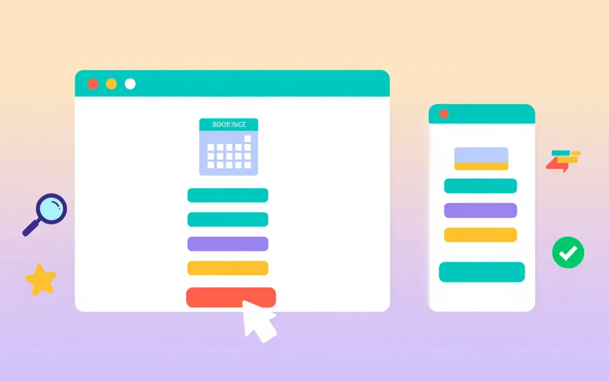
Core Elements of a High-Converting Booking Page
1. A Clear, Minimal Header
Your booking page header should include your logo and brand name, enough for users to feel confident they are in the right place, but strip out the full navigation menu. Navigation links give users an exit. On a booking page, you want users moving forward, not sideways.
2. Progress Indicators
If your booking flow has multiple steps (select service > pick date > enter details > pay), show the user where they are in the process with a step indicator. Progress indicators reduce abandonment by giving users a clear sense of how much effort remains.
3. Service Selection (Clean and Visual)
If you offer multiple bookable services or room types, present them in a clean card format with the service name, duration, price, and a brief description. Avoid long text blocks. Use visual hierarchy to make the most popular or recommended option stand out.
4. An Intuitive Date and Time Picker
The availability calendar is the centrepiece of the booking page. Best practices:
- Show a monthly calendar view with unavailable dates greyed out
- When a date is selected, show available time slots as clearly clickable buttons
- Highlight the selected slot visually before the user proceeds
- Display timezone information if your customers are in different regions
5. Minimal Data Collection
Only ask for information you actually need to confirm the booking. For a first booking, name, email, and phone number are typically sufficient. Every additional form field increases drop-off. Collect more information after the booking is confirmed, through follow-up communications.
6. Transparent Pricing
Show the full booking cost clearly before the payment step. Hidden fees discovered at checkout are the single biggest cause of booking abandonment. If there is a deposit and a balance due later, explain that clearly.
7. Trust Signals Near the Payment Form
Place security badges, payment provider logos (Visa, Mastercard, Stripe), and a brief privacy assurance near your payment form. Trust signals at the payment step reduce hesitation at the most vulnerable point in the conversion flow.
8. A Strong Confirmation State
The post-booking confirmation page and email are often overlooked, but they matter. A clear confirmation with booking details, what to expect next, and easy cancellation/rescheduling options creates confidence and reduces enquiries to your support team.
UX Principles for Booking Page Design
Reduce Cognitive Load
Booking decisions involve choosing dates, times, services, and entering payment information. That is a lot to process. Design choices that reduce cognitive load, one decision per screen, clear labelling, sensible defaults, directly increase completion rates.
Design for Mobile First
More than 60% of online bookings in many industries are now made on mobile devices. This means your booking page must be designed for a small touchscreen first, then scaled up for desktop. Large tap targets, minimal typing, and a vertically scrolling layout are all mobile-first requirements.
Eliminate Dead Ends
Every error state, validation failure, or payment failure must have a clear recovery path. A booking page that shows an error with no explanation of what went wrong, or no way to correct it, loses the customer at the worst possible moment.
Use Contextual Micro-Copy
Small pieces of explanatory text placed at the right moment reduce anxiety and answer questions before users ask them. Examples: ‘You will only be charged if the booking is confirmed’, ‘Your card details are encrypted and never stored on our servers’, ‘Free cancellation up to 48 hours before your appointment.’
Booking Page Design Mistakes to Avoid
Too many steps: Every additional step in the booking flow increases the chance of abandonment. Aim for three steps or fewer: service/date selection, customer details, payment.
Asking for unnecessary information: Requesting company name, date of birth, or secondary contact details on a first booking sends users away. Collect the minimum.
Poor error messages: ‘An error occurred’ is not helpful. ‘This time slot is no longer available. Please select another time.’ is helpful.
No mobile optimization: A desktop-only booking form with small buttons and dense text is unusable on a phone. Mobile optimization is not optional.
No autofill support: Form fields that do not support browser autofill force users to type everything manually on mobile. Always use correct input types and autocomplete attributes.
Slow page load: A booking page that takes more than 3 seconds to load loses a significant percentage of visitors before they even see the form. Performance optimization is part of booking page design.
Booking Page Design for Different Industries
Hotels and Accommodation
Hotel booking page design typically includes: room type selection with photos, a date-range calendar (check-in and check-out), guest count selection, rate comparison between room types, and a clear breakdown of the total cost including taxes and fees.
Healthcare and Appointments
Medical and wellness booking pages prioritize: practitioner selection, specialty filtering, clear time slot display, and strong privacy assurances. The tone should be calm and reassuring, with minimal design complexity.
Restaurants
Restaurant booking pages need: date and time picker, party size selector, special occasion or dietary preference fields, and a confirmation that does not require payment (or a small deposit for large parties).
Measuring Booking Page Performance
Once your booking page is live, measure its performance with these metrics:
- Booking completion rate, the percentage of users who start the booking flow and complete it
- Drop-off by step, where in the flow do users abandon?
- Mobile vs desktop completion rates, often very different, highlighting mobile UX issues
- Time to complete booking, if users take too long, the flow is confusing
- Return rate, users who visit the page multiple times before booking are hesitant; investigate why
Software Flux Solutions designs and builds booking page interfaces as part of our website development service. Every booking page we design is built with conversion, mobile performance, and brand consistency in mind.
For businesses whose booking pages are not converting as expected, our SEO and digital marketing team can run conversion rate optimization analysis and identify where users are dropping off.
Conclusion
A booking page is not just a form, it is the most commercially important page on your website. The design choices you make on that page directly determine how many of your website visitors become paying customers. Invest in getting the design right: minimal steps, clear information, mobile optimization, and strong trust signals at every stage.If you want your booking page designed and built by professionals who understand conversion, get in touch with Software Flux Solutions. We have designed booking interfaces for businesses across hospitality, healthcare, and professional services.